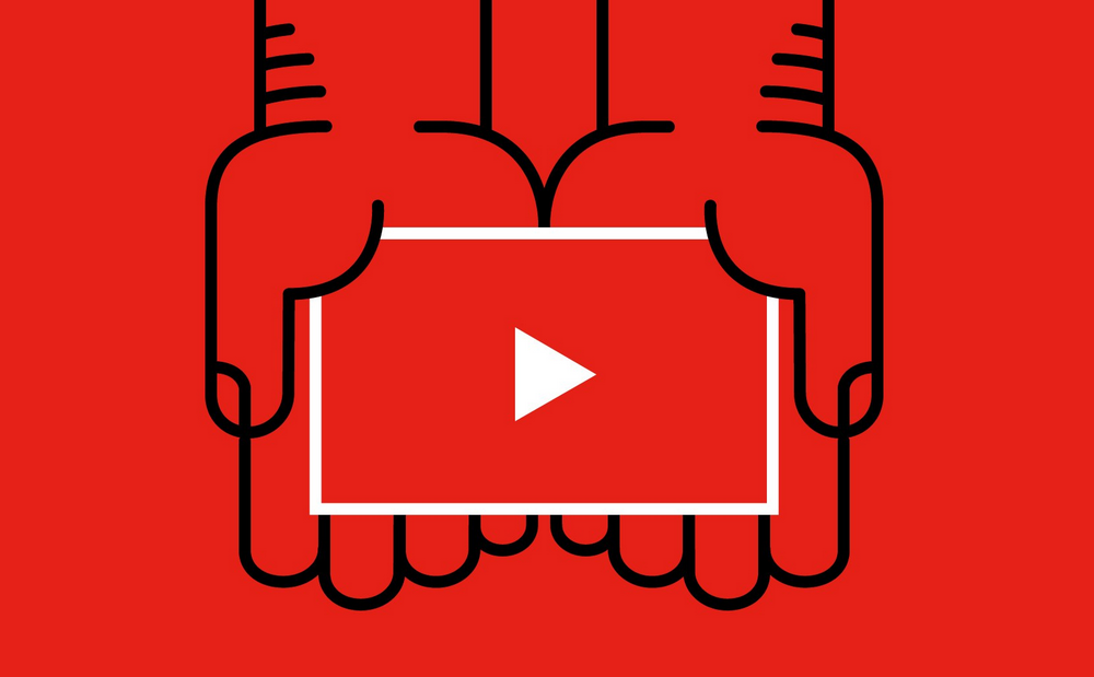
 YouTube introduces a dark mode and a new logo
About three months ago, when YouTube was celebrating its 12th anniversary, the service start testing out several changes that looked very interesting at the time. It seems that the beta phase is now over as the company has recently started rolling out the dark theme, the new YouTube logo and the vertical mode to all of its users. There are new features for both the desktop and the mobile versions of YouTube and they are rolling out as we speak.
Let's begin with the new logo which, according to Google, is now more adaptable to various screen sizes. Depending on how much data can be displayed, the service can now choose between displaying the icon, text or the entire logo. As far as the dark theme is concerned, it looks pretty good; it modifies the way the YouTube menu is being displayed and it's also quite relaxing for the eyes. Unfortunately, even though it's clearly based on Material Design, this theme is only available on desktops. On mobiles, the navigation bar has been moved to the bottom of the screen, there are new Library & Accounts tabs and you can now watch videos in full-screen vertically.
 YouTube's new logo
As far as I'm concerned it's nice to see these features finally become publicly available, especially the dark theme and the bottom buttons on mobiles, as I find them very helpful. Since Facebook is trying even harder to encroach into its territory with the new Watch tab, it's great to see Google's video-sharing service striving to become better.