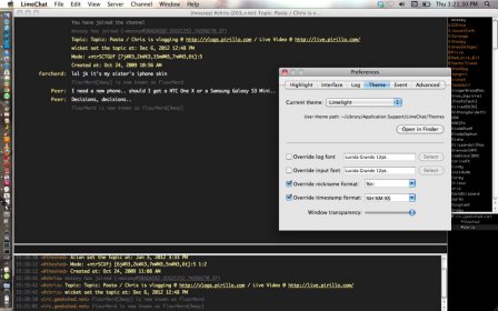
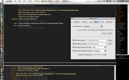
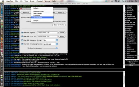
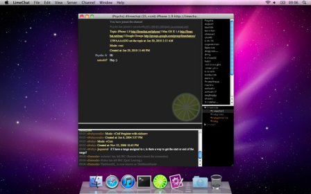
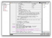
I want to share my expectations, as I liked the design, the icon especially, but wasn't brave enough to try it out. It frightened me in terms of colours, as I think it will be difficult to read colourful texts on black backgrounds.
Honor should be given to the developers of the program for the icon they've created: it's very eye-catching. At the same time, the interface inside the application is rather difficult to use for a long time as you have bright-colored text on a black background by default. This is quite hard on the eyes. All in all, the application may be handy.


Comments (2)